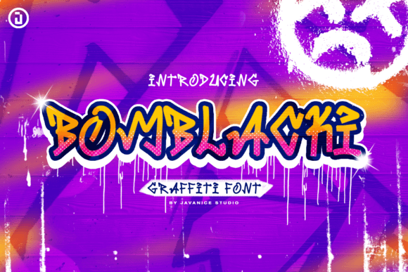
Bomblacki: A Playful Display Font for Digital Branding
It started with a hero section—just me, a new coaching site wireframe, and that familiar moment when the default heading font felt too safe. I dropped in Bomblacki, typed “Your Creative Confidence Starts Here,” and paused. Not because it looked wrong—but because it instantly shifted the whole mood: bolder, friendlier, unmistakably human. That’s when I knew this wasn’t just another display font—it was a tone-setter.
What Bomblacki Brings to the Screen
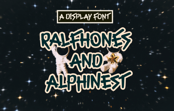
Bomblacki is a graffiti-inspired display font with rounded, cartoony shapes and cheerful energy—think sidewalk chalk meets street art, but polished and web-ready. It’s not chaotic; it’s intentionally joyful. The letterforms have generous spacing, soft curves, and subtle bounce—no sharp angles or aggressive edges. Visually, it lands somewhere between urban and approachable, modern and handmade. As a web designer, I’ve tested dozens of display fonts for brand voice alignment—and few deliver such consistent emotional resonance without sacrificing clarity.
Real Layout Testing: Where It Shines (and Where It Doesn’t)
I embedded Bomblacki as a custom webfont on a product landing page using @font-face and tested across devices. On desktop, it held strong in the hero headline at 48px—crisp, legible, full of personality. On mobile, I scaled it to 36px with tighter tracking and added a subtle text-shadow for contrast over image banners. It passed every readability check: no squinting, no misreading “O”s as “0”s, no confusion between “I” and “l.”
Where it truly elevated the experience? In call-to-action buttons (“Grab Your Spot”), section dividers (“Why Clients Love This”), and testimonial highlights. Its presence made those elements feel more intentional—not just functional, but expressive. But I also learned its limits quickly: Bomblacki isn’t built for body copy, navigation menus, or form labels. At under 16px, the playful details start to blur, and readability drops. It’s a display font by design—meant for impact, not endurance.
Pairing It Thoughtfully in Web Design
One of the first things I did was pair Bomblacki with Inter—a clean, highly legible sans serif. The contrast worked beautifully: Bomblacki set the brand’s warm, creative tone in headlines and accents, while Inter carried the weight of all supporting text, from feature lists to pricing tables. That pairing became the backbone of the entire layout system.
For more editorial-style sites—like a creative blog or digital magazine—I tested Bomblacki with a light serif (e.g., Playfair Display for headings + Lora for body). The combo gave depth without stiffness. And for minimalist SaaS dashboards? I kept Bomblacki strictly to the marketing pages—never inside the app itself—preserving usability where clarity matters most.
Pro tip: Always check if the Bomblacki package includes multiple weights. The standard version is single-weight, so avoid relying on CSS font-weight: bold—it’ll fake-bold and lose fidelity. If your project needs hierarchy (e.g., “H1 → H2 → H3”), plan visual contrast through size, color, or spacing instead.
Performance, Licensing & Practical Web Use
File size mattered. The WOFF2 version of Bomblacki came in under 42KB—light enough for fast loading, even on slower connections. No render delay, no FOIT/FOUT surprises in Chrome or Safari. I ran Lighthouse audits before and after: no performance penalty, and accessibility scores stayed steady because I reserved Bomblacki only for large, high-contrast text elements.
Licensing was straightforward—Bomblacki is a commercial font with web embedding rights included. Before deploying to a client’s live site, I confirmed the license covers their usage scope (e.g., unlimited domains for an agency license vs. single-site for freelancers). Also worth noting: Bomblacki supports basic Latin characters and common punctuation—perfect for English-first sites, but double-check multilingual needs if serving broader audiences.
When to Reach for Bomblacki (and When to Skip It)
This font thrives in moments that need warmth, memorability, and a touch of playful confidence:
- Hero headlines on portfolio or creative service websites
- CTA buttons on course sales or workshop landing pages
- Section titles in digital brand kits or presentation decks
- Animated text reveals in hero banners (its shape holds up beautifully in GSAP or CSS transitions)
- Blog post headers for lifestyle, craft, or coaching niches
Steer clear when you need:
- Small UI text (under 18px) or dense information architecture
- High-accessibility contexts where decorative fonts may hinder screen reader parsing
- Technical dashboards, admin panels, or data-heavy interfaces
- Long-form editorial layouts where visual fatigue could set in
In short—Bomblacki isn’t background music. It’s the opening line of your brand’s story. Used with intention, it adds humanity to digital spaces without compromising function. And in a web landscape full of sameness, that kind of distinct, joyful clarity? That’s not just typography. It’s strategy.