Miami Display Font for Bold, Friendly Digital Headlines
It started with a hero section that felt… polite. Too polite. I was refining the homepage for a boutique coaching site—clean layout, thoughtful imagery, warm color palette—but the headline just sat there, quiet and unremarkable. So I swapped in Miami. Instantly, the space breathed differently. Not louder—livelier. That’s the first thing you notice: Miami doesn’t shout; it leans in with confident charm, like a trusted collaborator who knows exactly when to add energy without overwhelming.
A Display Font That Feels Human, Not Engineered
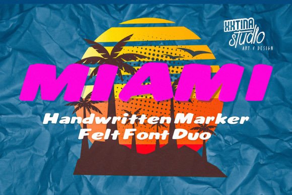
Miami is a display marker-felt typeface—soft-edged, slightly textured, and full of organic rhythm. It’s not pixel-perfect, and that’s its strength. The subtle irregularity in stroke weight and letterform warmth gives it tactile authenticity, like hand-lettered signage or a carefully inked chalkboard. Visually, it lands somewhere between friendly modern and approachably nostalgic—think coastal café signage meets contemporary editorial design. It’s not a script, not a serif, not a rigid sans. It’s its own category: a display font built for impact, personality, and immediate recognition.
How Miami Performs Where It Matters Most
I tested Miami across real digital contexts—not just static mockups, but live previews on iOS and Android, dark and light mode toggles, and varying viewport widths. Here’s what stood out:
- Hero headlines: At 48–64px on desktop and scaled responsively (32–40px on mobile), Miami maintains clarity and presence—even over busy image backgrounds. Its generous x-height and open counters prevent visual crowding.
- Landing page section headers: Used as H2s in a course sales page, it created clear visual breaks without competing with supporting copy. Paired with a neutral sans serif (Inter, set at 18px/1.5 line height), the hierarchy felt intuitive and trustworthy.
- CTA buttons and feature cards: At 18–20px, it works beautifully on primary action buttons—especially with ample padding and high-contrast backgrounds. Avoid using it below 16px, where the felt-like texture begins to blur on lower-DPI screens.
- Branded graphics and social banners: Exported as SVG for web use, Miami renders crisply at any scale. I used it in animated banner previews for Instagram ads—and it held up perfectly in motion, never appearing “jittery” or thin.
Where Miami Shines—and Where to Pause
Miami excels in moments of intention: the first thing users see, the emotional hook, the brand signature. It’s ideal for portfolio sites (a designer’s name in Miami above a grid of work), boutique online stores (seasonal campaign banners like “Summer Edit” or “New Arrivals”), blog headers (a vibrant “Recipe Notes” title over a food photo), and digital brand kits (where it anchors mood boards and style guidelines).
But it’s not meant for everything. I tried it in navigation menus—it lost legibility fast at small sizes and didn’t scale well with hover transitions. Form labels? Too decorative. Body copy? Absolutely not. Accessibility audits flagged contrast issues when used over mid-tone images without overlays. And while it supports basic Latin multilingual characters (including accented letters common in French, Spanish, and Portuguese), double-check extended language support if your audience spans broader regions.
Smart Pairing Keeps the Focus Where It Belongs
Miami thrives when paired intentionally. My go-to combo: Miami for headlines + Inter or Manrope for all supporting text. Why? Inter offers exceptional readability at small sizes, strong hinting for screen rendering, and seamless weight matching (300–600). Manrope adds subtle geometric warmth without competing visually. Both are open-source, web-optimized, and load quickly—critical when Miami itself is served as a lightweight WOFF2 file.
I also experimented with pairing Miami against a restrained serif (like IBM Plex Serif) for a more editorial feel—say, on a writer’s blog or newsletter landing page. It worked beautifully for short, evocative headers (“Thoughts Worth Keeping”, “The Quiet Work”) but required tighter line spacing and careful vertical rhythm to avoid visual tension.
Practical Considerations Before You Deploy
Before adding Miami to a live site or client project, verify three things: First, confirm the license covers commercial web use—including embedded fonts in SaaS dashboards or client-facing templates. Second, check what’s included: Does the package offer webfont files (WOFF2 preferred), variable font support, stylistic alternates, or ligatures? Third, test fallback behavior. Define a graceful stack like font-family: "Miami", -apple-system, BlinkMacSystemFont, "Segoe UI", sans-serif; so browsers without Miami still render cleanly.
Also worth noting: Miami comes in a single weight (regular), which simplifies loading but means you’ll rely on your body font for visual contrast in layered typography. That’s fine—it keeps focus on Miami’s expressive role, not structural variety.
In the end, Miami isn’t about decoration. It’s about resonance. It’s the difference between a headline that informs and one that invites. Between a landing page that loads—and one that lingers. If your digital brand values warmth, clarity, and quiet confidence, Miami isn’t just a display font. It’s a thoughtful design decision—one that shows up, stands out, and stays human.